My 14 years at AOL was, and remains to be, some of the most fulfilling and rewarding work I have had the pleasure of contributing to. The exhilaration of creating design systems from the ground up is a challenge and a joy I truly am passionate about.
I was part of a SWAT team tasked with creating a feed driven responsive content site. Taking advantage of our robust AOL Search engine, coupled with our immersive analytics of our web traffic, we created a product that scaled and produced traffic recirculation, to obvious benefit for the bottom line.
Tiered Content Design
I took on the task of making sure our content would shine on any device. This consideration was not purely visual, but also dependent on a editorial system that was based in module layout consistency, to help users quickly be able to comfortably traverse multiple tiers of dynamically driven channels, directories, and content.
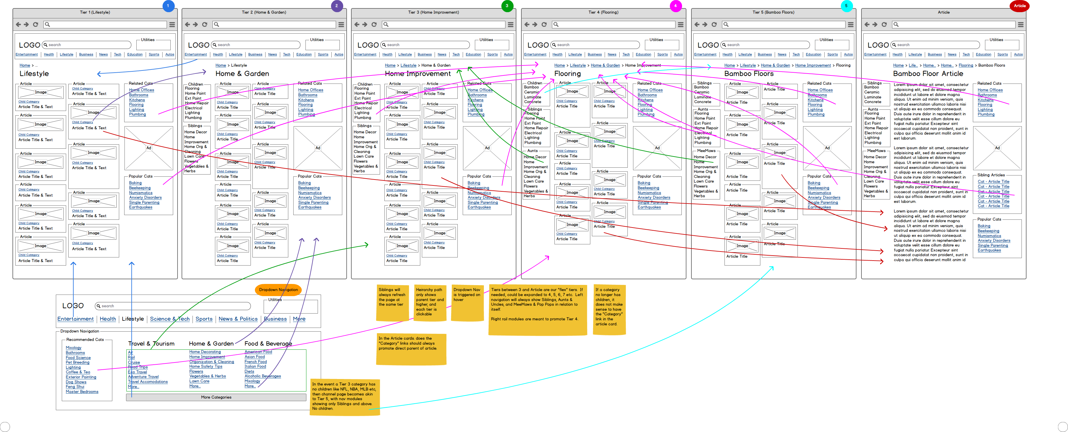
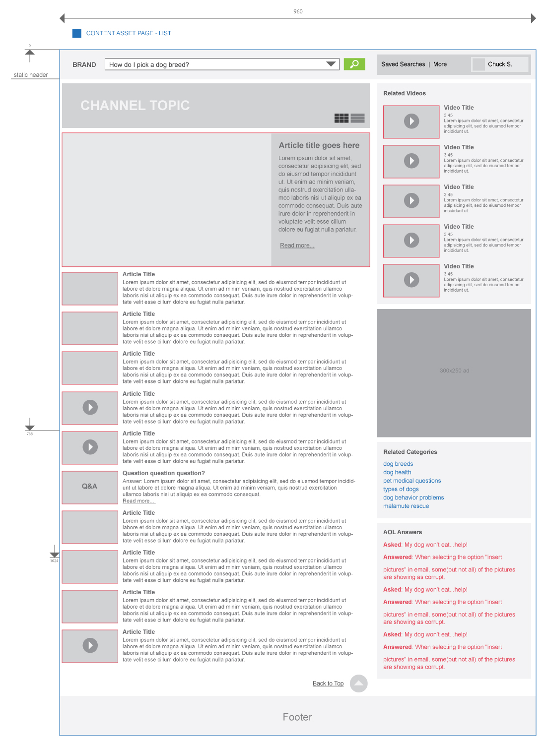
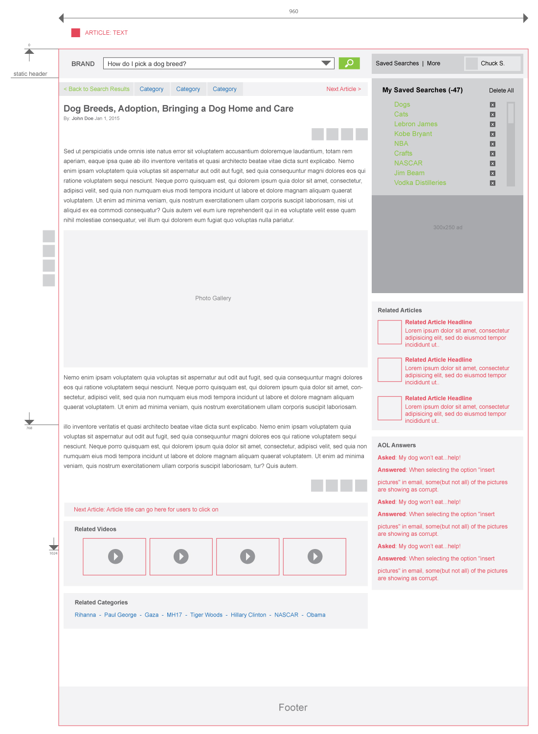
Here are examples of the multi-tiered content system we produced and implemented.
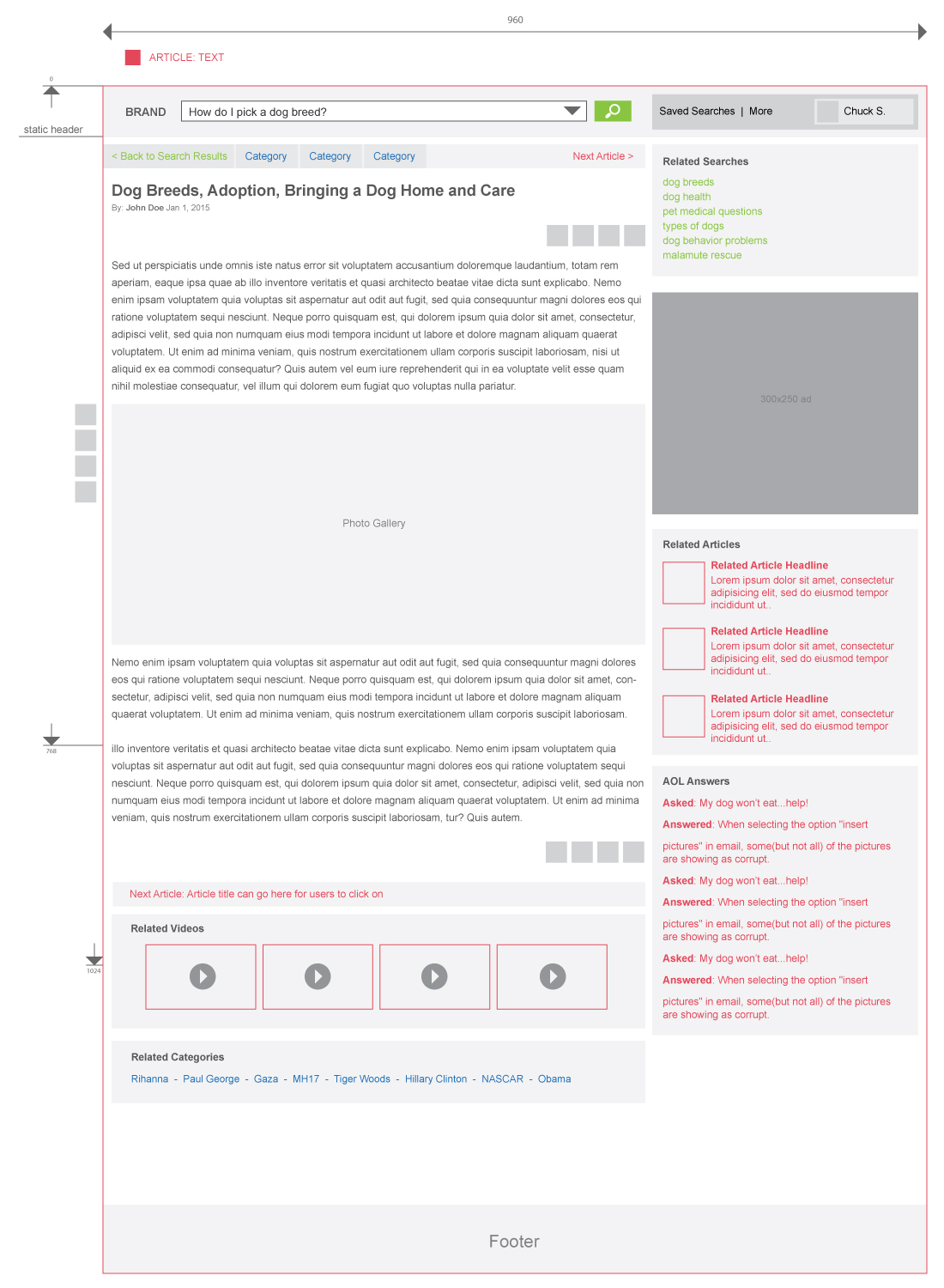
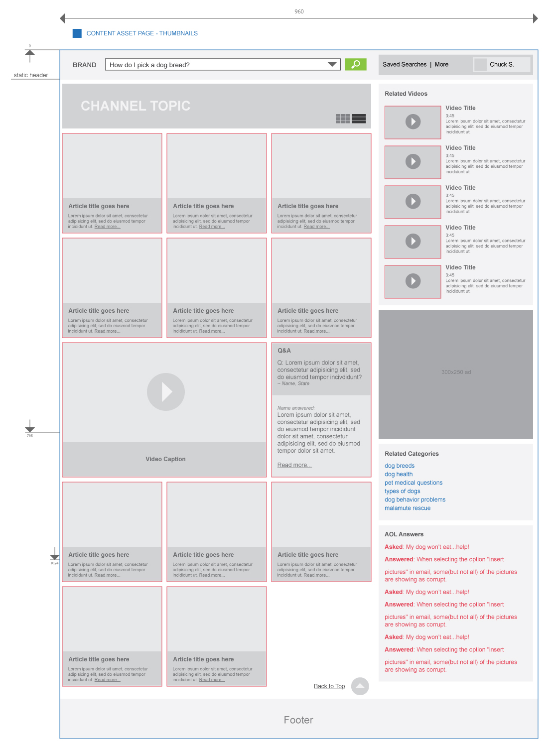
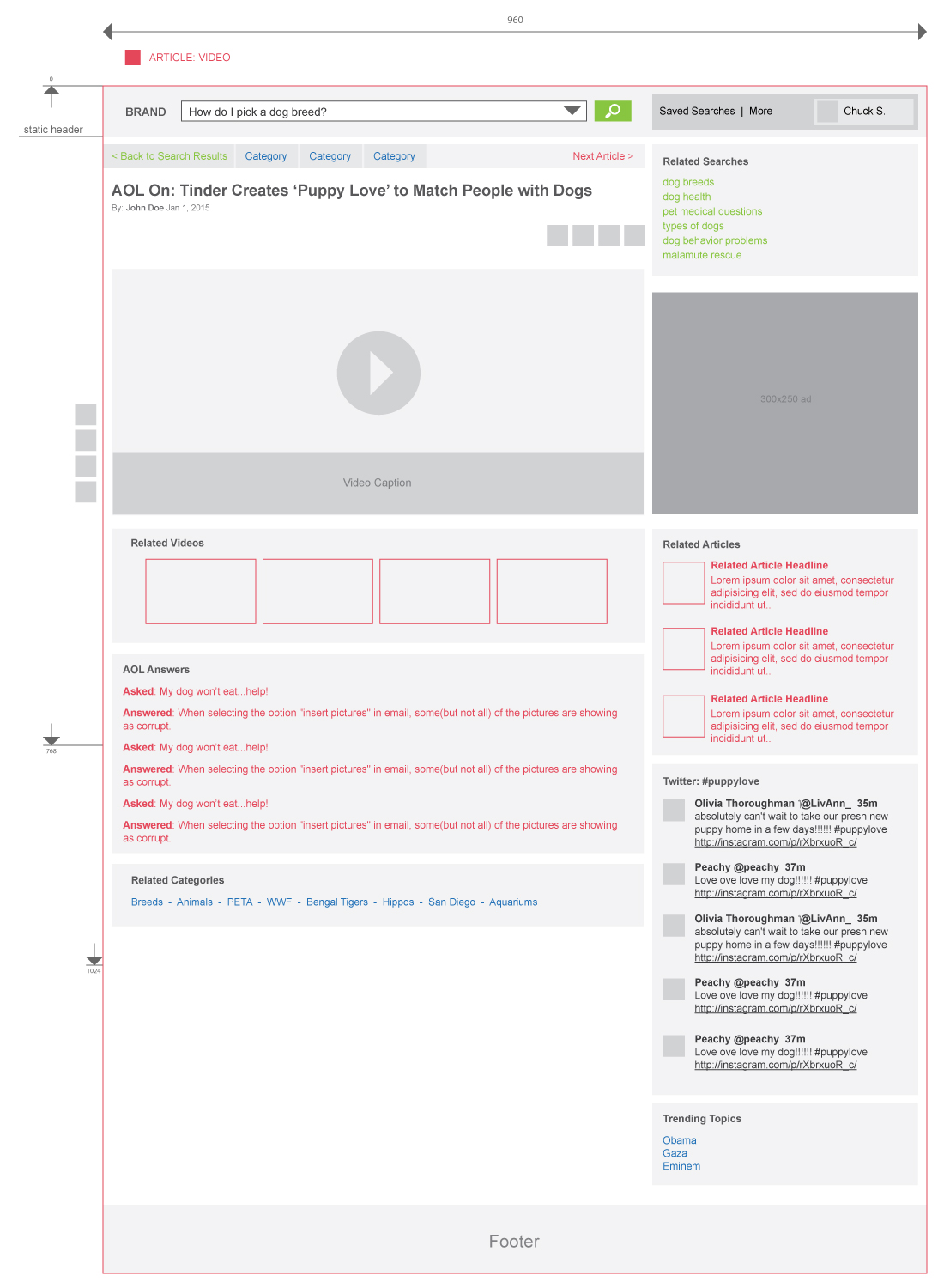
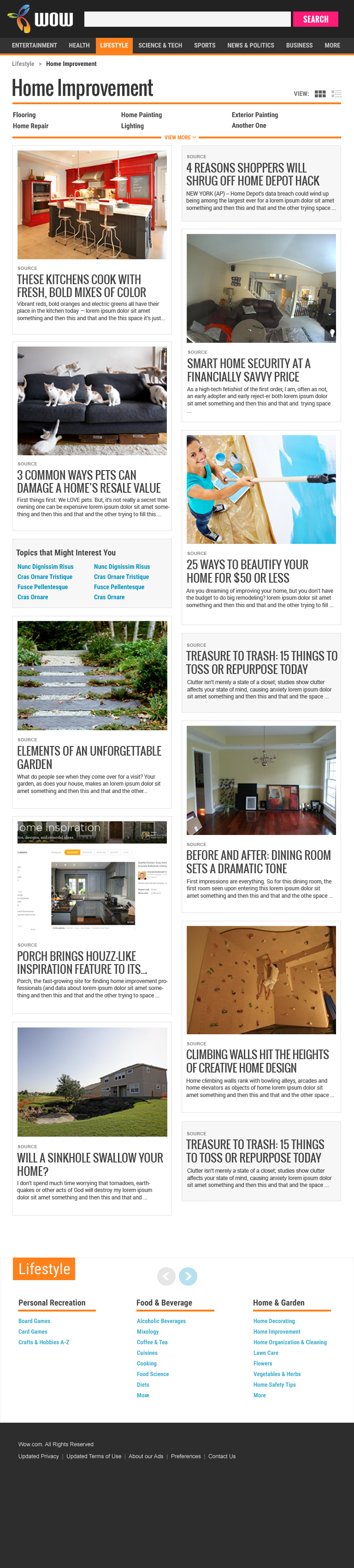
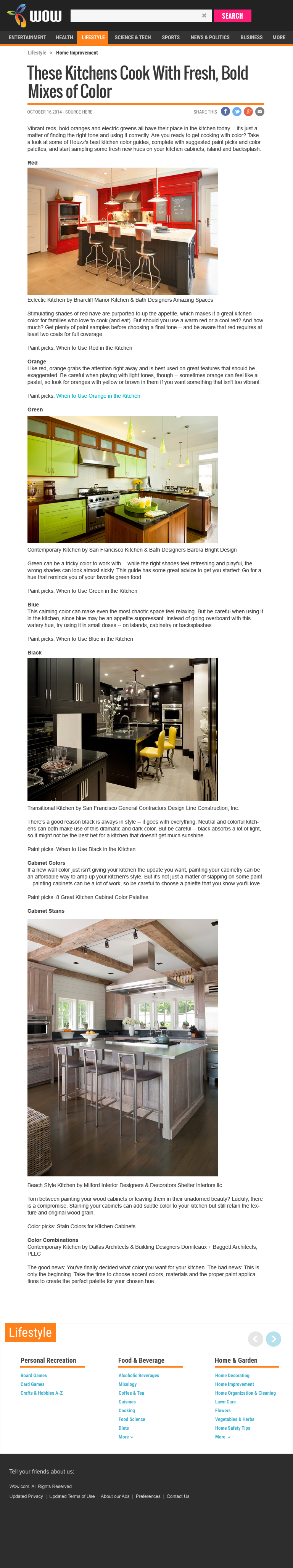
Responsive Solutions
The work shown in this section reflects the responsive designs for both tablet and mobile devices. These particular mocks represent a Channel page, listing article excerpts with thumbnails and a few lines of teaser text.
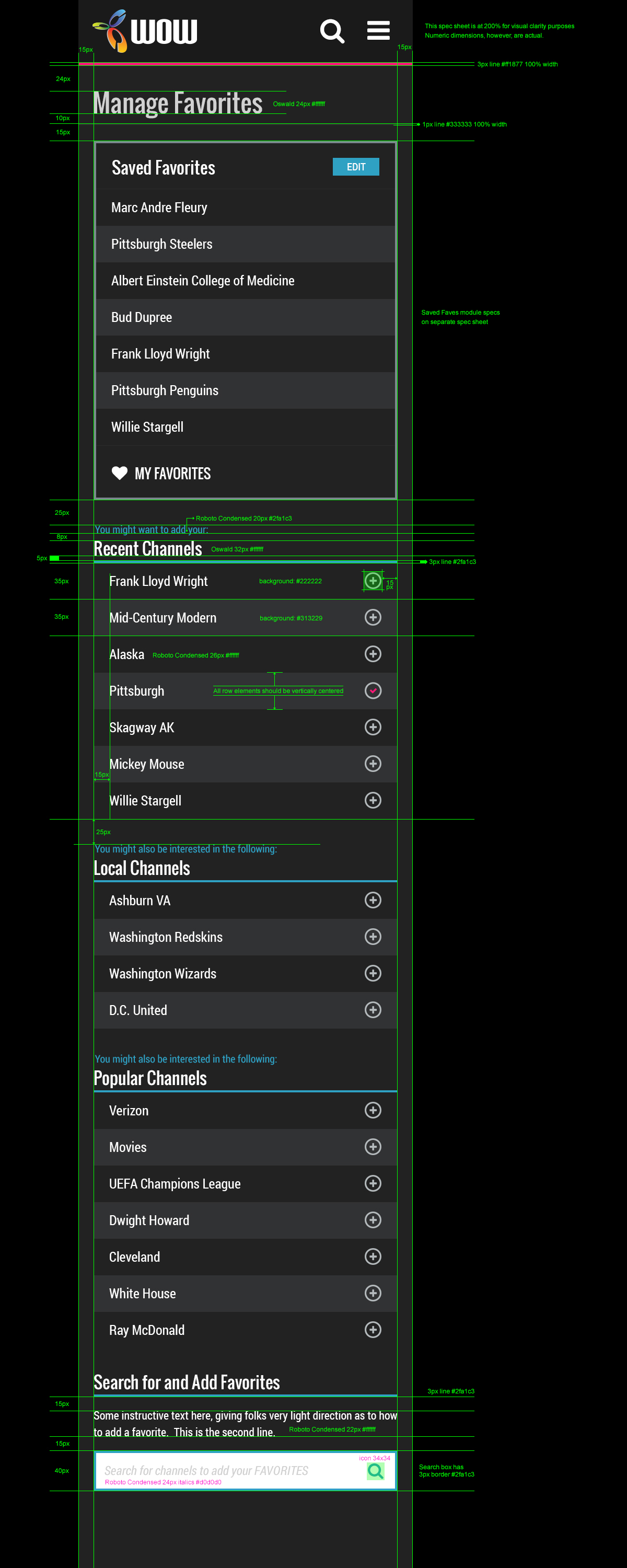
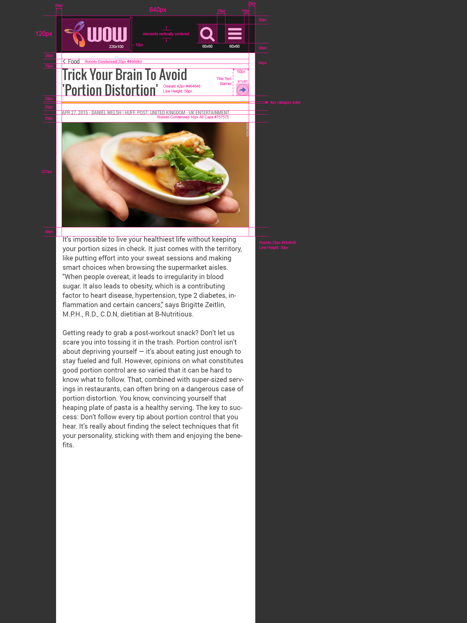
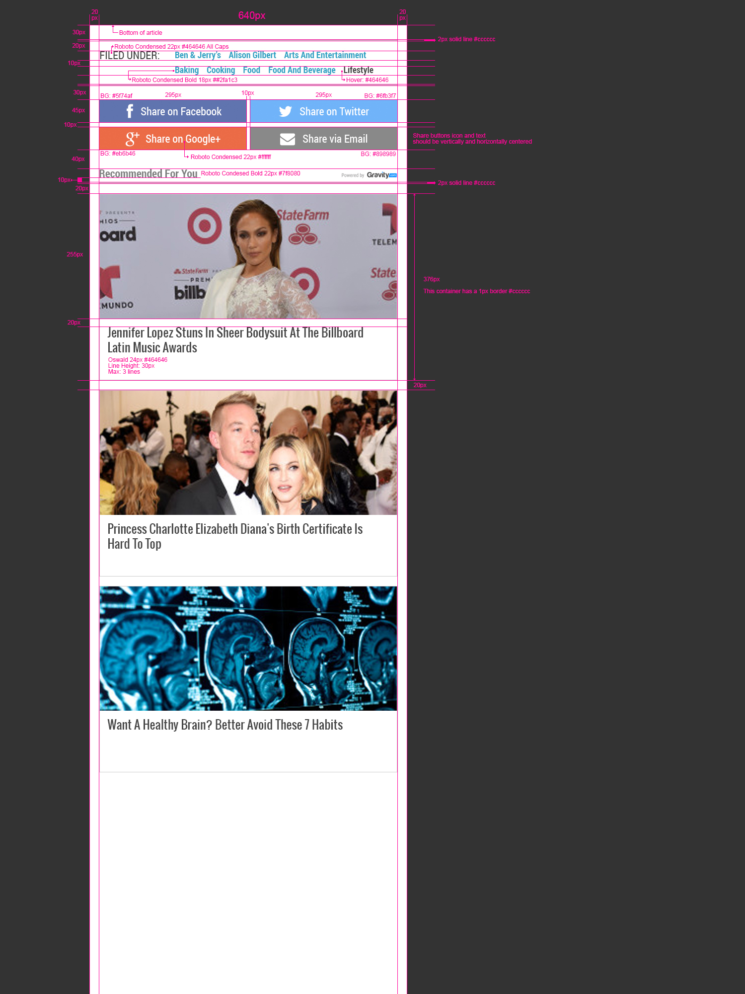
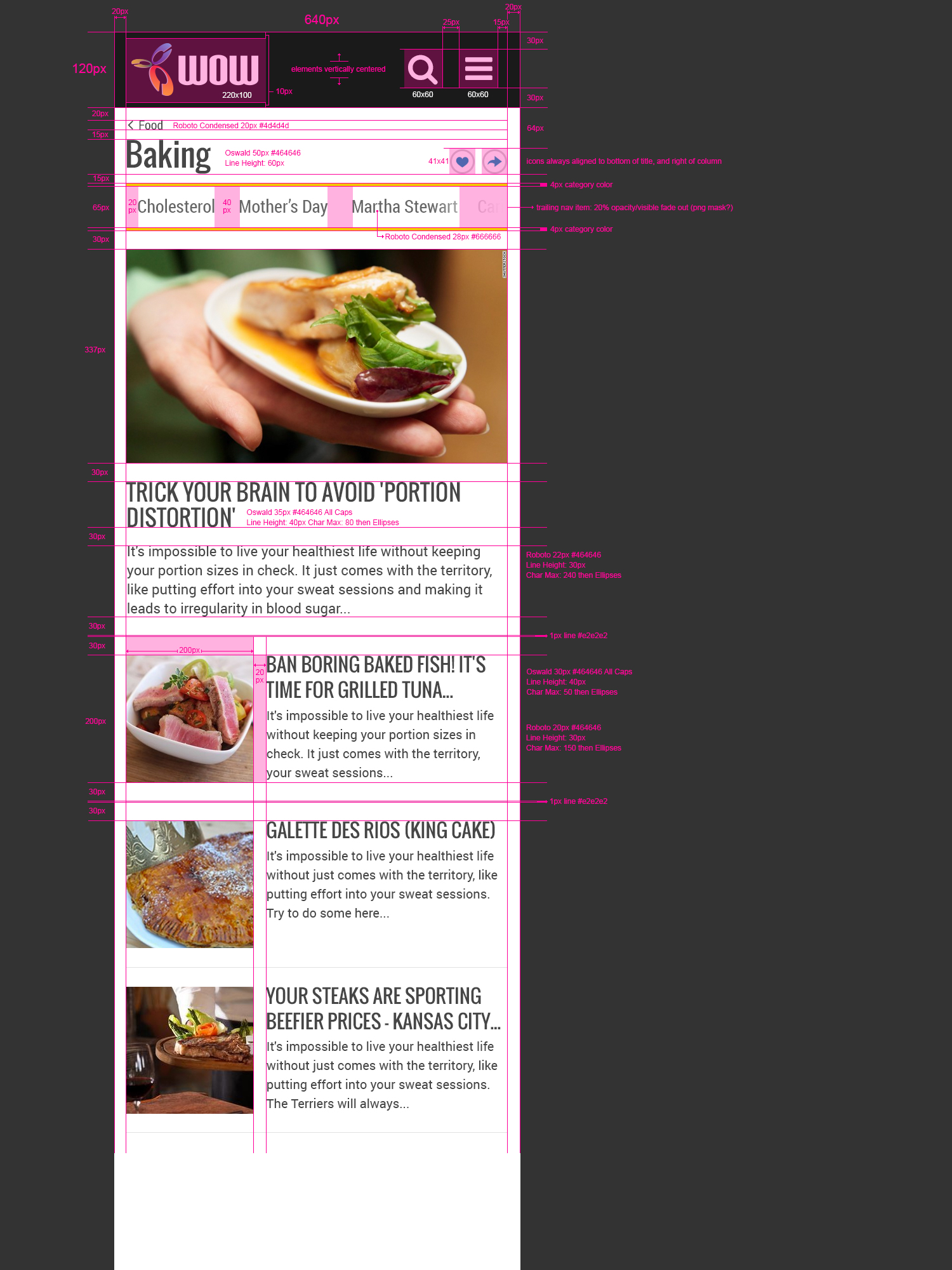
Here are some detailed assets and artifacts we produced to ensure we maintain quality as the product moved through the development lifecycle.
Nowadays we have Marketch for Sketch, or Marvelapp Handoff. Thanks heavens 🙂